The SwiftUI Design System for modern apps
Production-ready components with design tokens, spring animations, and dark mode — built natively for iOS, macOS, and visionOS.
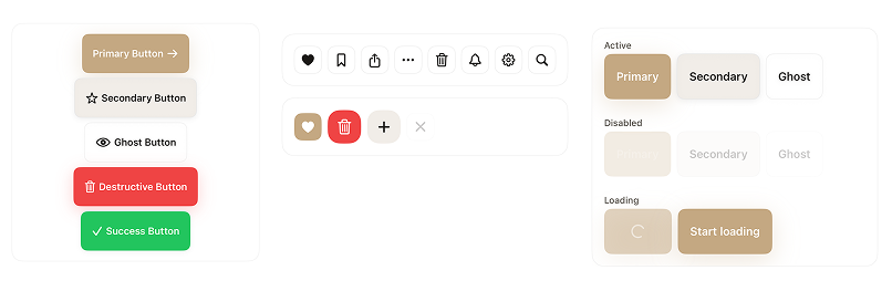
Components
The main examples, without the noise
A more focused look at SwiftDS: buttons, cards, inputs, and data visualization, all using the same visual language.
Real use cases
Real use cases.
A single, focused example is enough here. Start with the Todo showcase to see how SwiftDS comes together in a real app flow.
Todo
A real showcase with task creation, filtering, quick actions, and the kind of UI composition you would expect in a production app.
Want to interact with these apps?
Import the package into your project and call the main showcase view to explore the included real app examples.
import SwiftDS

struct ContentView: View {
    var body: some View {
        DSShowcaseRoot()
    }
}Features
Built for production
SwiftDS gives you everything you need to ship polished, consistent, accessible SwiftUI apps faster.
60+ Components
Buttons, inputs, modals, navigation bars, cards, charts, onboarding flows — everything a modern app needs.
Design Tokens
Centralized color, spacing, typography, radius, and shadow tokens. Change the whole look from one file.
Spring Animations
Every interaction uses SwiftUI's physics-based spring system for natural, satisfying micro-interactions.
Dark Mode Native
All components respond automatically to the system color scheme using semantic design tokens.
Accessible by Default
Full VoiceOver support, Dynamic Type, Reduce Motion, and minimum touch targets on every component.
Swift Package Manager
Zero setup, zero dependencies. Add the package URL and you're ready to build.
Production Ready
Battle-tested patterns, edge cases handled, and thoroughly documented for real-world apps.
All Platforms
iOS, iPadOS, macOS, watchOS, tvOS, and visionOS — a single codebase, all surfaces.
Usage
Clean, expressive SwiftUI
Components feel native to SwiftUI. Design tokens replace magic numbers, and every modifier has a clear, readable name.
Installation
Up and running in minutes
SwiftDS ships as a Swift Package. No CocoaPods, no Carthage — just Xcode's native package manager.
Add the package
Open your Xcode project and navigate to File → Add Packages.
https://github.com/luizmellodev/SwiftDS-package
Import SwiftDS
Add the import to any Swift file where you want to use the components.
import SwiftDS
Use the design tokens
Reference design tokens for colors, spacing, and typography across your app.
Text("Hello")
    .dsTextStyle(.heading1)
.foregroundStyle(DSColor.textPrimary)Compose components
Drop in ready-made components or build your own using the token system.
DSButton("Get Started", variant: .primary) {
    // your action here
}