DSChip
selectionAction chip with title, optional icons, and variant-based styling for filters and tags.
Purpose
Use chips for selectable filters, removable tags, or compact action buttons. Supports three visual variants (filled, soft, outlined) and optional leading/trailing icons or close button.
Interactive Reference
Live showroom
Need the full visual surface?
Screenshots do not scale well across every component, state, and variant. For the real interactive reference, import the package and launch DSShowcaseRoot().
Best for exploring:
variants, states, categories, and real app examples in one place.
Variants
.filled
Solid tinted background; fully opaque when selected
.soft
Soft muted background; no border, deepens on selection

.outlined
No fill, only border; border turns accent-colored on selection
States
Unselected, normal state
Accented appearance with scale animation
Dimmed at 50% opacity, disabled interaction
Props
| Prop | Type | Default | Description |
|---|---|---|---|
| titlereq | String | — | Chip label text |
| leadingIcon | String? | nil | Optional SF Symbol on leading side |
| trailingIcon | String? | nil | Optional SF Symbol on trailing side |
| size | DSChipSize | .md | Chip size: .sm or .md |
| variant | DSChipVariant | .filled | Visual style: .filled, .soft, or .outlined |
| color | Color | DSColor.primary | Accent color for the chip |
| isSelected | Bool | false | Shows filled/accented appearance when true |
| isCloseable | Bool | false | Appends a × dismiss button |
| isUnavailable | Bool | false | Dimmed and disabled when true |
| accessibilityLabel | String? | nil | Optional accessibility label override |
| action | (() -> Void) | {} | Main tap action |
| onClose | (() -> Void)? | nil | Called when × button is tapped |
Examples
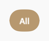
Filter chips
Single-select filter group with filled variant.
let filters = ["All", "Active", "Done"]
@State var selected = "All"

HStack {
    ForEach(filters, id: \.self) { filter in
        DSChip(filter, variant: .filled, isSelected: selected == filter) {
            selected = filter
        }
    }
}
Colored chip with icon
Soft variant with leading icon and custom color.
DSChip("Dark Mode",
leadingIcon: "moon.fill",
variant: .soft,
color: DSColor.info,
isSelected: isDarkMode
) {
isDarkMode.toggle()
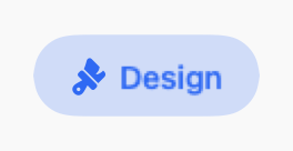
}Removable tag
Closeable chip for removable tags.
DSChip("Design",
    variant: .soft,
    color: DSColor.accent,
    isCloseable: true,
    action: {}
) {
    tags.remove("Design")
}
Usage Guidelines
- Use filled variant for primary filters and selections
- Use soft variant for secondary tags and categories
- Use outlined variant for minimal UI or when space is limited
- Keep chip labels short (1-2 words) for better scannability
- Use isCloseable for removable tags, not for filters
- Group related chips with DSChipGroup for consistent spacing
When to Use
✓ Use DSChip for:
- • Multi-select filters where users can pick multiple options
- • Removable tags for user-generated content (with isCloseable)
- • Category selection with visual feedback
- • Compact action buttons in toolbars or filter bars
✗ Avoid using for:
- • Single non-interactive labels (use DSBadge)
- • Status indicators with icons (use DSStatusLabel)
- • Navigation between sections (use DSTabBar)
- • More than 8-10 chips in a row (consider DSSelectField dropdown)
Consider instead:
For non-interactive labels, counts, or status indicators
For read-only category labels without interaction
For multi-select with checkmark feedback
For mutually exclusive options (only one selected)
Accessibility
VoiceOver
Announces 'Design, Chip, Selected' or 'Not selected'. Close button announced separately
Keyboard
- • Space to toggle selection
- • Delete/Backspace when isCloseable to remove
Dynamic Type
✓ Supported
Contrast
WCAG AA compliant for all variants (text 4.5:1, border 3:1)
Traits
.isButton.isSelected when isSelected is trueCustom hint via accessibilityHint