DSButton
actionsUniversal button component with 5 visual variants, 3 sizes, icon support, loading and disabled states. Uses spring animations for micro-interactions.
Purpose
DSButton is the primary action component in the system. Use it in forms, dialogs, and any situation that requires an explicit user action.
Interactive Reference
Live showroom
Need the full visual surface?
Screenshots do not scale well across every component, state, and variant. For the real interactive reference, import the package and launch DSShowcaseRoot().
Best for exploring:
variants, states, categories, and real app examples in one place.
Variants
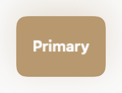
.primary
Main action on the screen. Use only one per visible context.
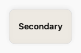
.secondary
Secondary action complementing the primary.
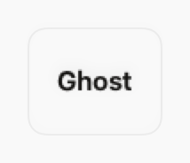
.ghost
Tertiary or low-priority action. Transparent background.
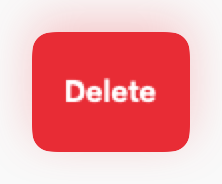
.destructive
Irreversible actions such as deleting or cancelling a subscription.

.success
Confirmation of a successful action or approval.
States
Resting state.
Slight scale up (1.015×) with a subtly different color.
Scale down to 0.96× via spring animation.
Replaces the label with DSSpinner. Action is disabled.
45% opacity. All events are blocked.
Props
| Prop | Type | Default | Description |
|---|---|---|---|
| titlereq | String | — | Button label text. |
| variant | DSButtonVariant | .primary | Visual style. |
| size | DSButtonSize | .md | Size (.sm, .md, .lg). |
| icon | String? | nil | SF Symbol to display alongside the text. |
| iconPosition | HorizontalAlignment | .leading | Icon position (.leading or .trailing). |
| isLoading | Bool | false | Shows spinner and disables action. |
| isDisabled | Bool | false | Disables the button. |
| actionreq | (() -> Void) | — | Closure executed on tap. |
Examples
Basic usage
Primary button with a simple action.
DSButton("Save", variant: .primary) {
    viewModel.save()
}
With icon and loading state
Button that shows a spinner while saving.
DSButton(
    "Submit",
    variant: .primary,
    icon: "paperplane.fill",
    isLoading: viewModel.isSaving
) {
    viewModel.submit()
}
Action group
Combination of primary, secondary and ghost.
HStack(spacing: DSSpacing.sm) {
    DSButton("Confirm", variant: .primary, action: confirm)
    DSButton("Cancel", variant: .ghost, action: cancel)
}
Destructive with confirmation
Always pair with a confirmation dialog.
DSButton("Delete account", variant: .destructive) {
    showConfirmationAlert = true
}
Usage Guidelines
- Use at most 1 primary button per visual section.
- Never disable buttons without explaining the reason to the user via hint text.
- On mobile, ensure a minimum height of 44pt for accessibility.
- Prefer the .ghost variant for navigation actions or inline links.
When to Use
✓ Use DSButton for:
- • Primary actions in forms, dialogs, and screens (Save, Submit, Confirm)
- • Call-to-action buttons in marketing sections
- • Destructive actions with confirmation (Delete, Remove)
- • Success confirmations (Complete, Approve)
✗ Avoid using for:
- • Navigation between screens (use NavigationLink or DSLink)
- • Icon-only actions in toolbars (use DSIconButton)
- • Inline text actions (use DSLink)
- • More than 3 buttons in a row (consider DSMenuButton or DSBottomSheet)
Consider instead:
For inline text links or secondary navigation
For icon-only actions in compact spaces
For grouped actions or overflow menus
Accessibility
VoiceOver
Announces label and state (e.g., 'Save, button' or 'Save, loading, button'). Disabled state is announced automatically.
Keyboard
- • Space or Return to activate
- • Tab to focus in forms
- • Command+Return for primary actions
Dynamic Type
✓ Supported
Contrast
Colors follow design best practices for readability in both light and dark modes
Traits
.isButtonState changes (loading, disabled) announced automaticallyCustom label via accessibilityLabel parameter