DSAlert
feedbackInline alert banner with an icon, title, optional message, and a dismiss button. Non-modal.
Purpose
Contextual feedback inside forms or sections, without interrupting the full screen.
Interactive Reference
Live showroom
Need the full visual surface?
Screenshots do not scale well across every component, state, and variant. For the real interactive reference, import the package and launch DSShowcaseRoot().
Best for exploring:
variants, states, categories, and real app examples in one place.
Variants
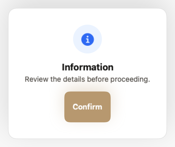
.info
Neutral information. Blue tint.
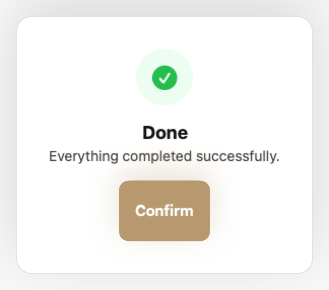
.success
Action confirmed. Green tint.
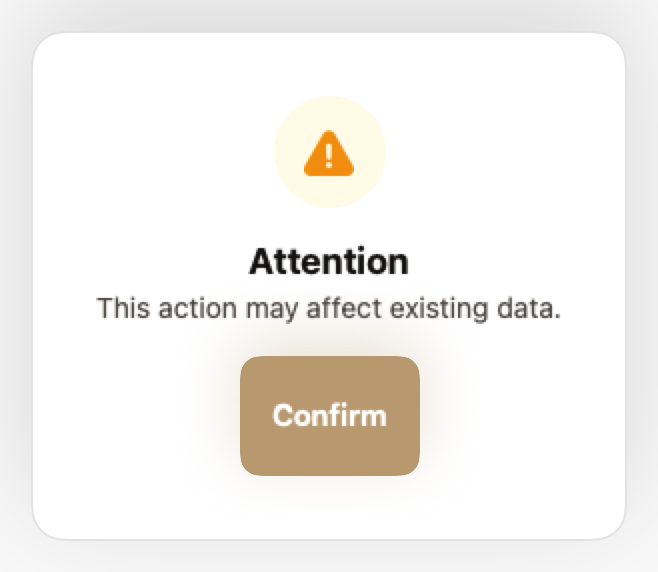
.warning
Requires attention. Yellow tint.
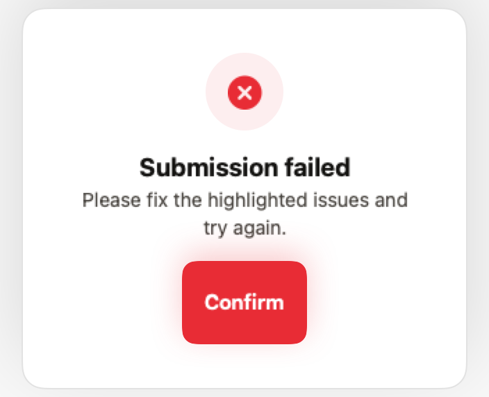
.error
Failure or validation error. Red tint.
Props
| Prop | Type | Default | Description |
|---|---|---|---|
| titlereq | String | — | Alert heading. |
| message | String? | nil | Optional body text. |
| style | DSToastStyle | .info | Semantic style. |
| isDismissable | Bool | true | Shows a close button. |
Examples
Form validation banner
Error alert shown when form submission fails.
if viewModel.hasError {
    DSAlert(
        title: "Submission failed",
        message: viewModel.errorMessage,
        style: .error
    )
}
Success confirmation
Persistent success message in a form.
VStack(alignment: .leading, spacing: DSSpacing.md) {
    if formSubmitted {
        DSAlert(
            title: "Form submitted successfully",
            message: "We'll review your application and get back to you within 48 hours.",
            style: .success
        )
    }

    // Form fields...
}
Composition: Warning with action
Alert with inline action button.
DSAlert(
    title: "Storage almost full",
    message: "You're using 95% of your storage. Upgrade to get more space.",
    style: .warning,
    isDismissable: false
)

DSButton("Upgrade Now", variant: .primary) {
    showUpgradeModal = true
}
When to Use
✓ Use DSAlert for:
- • Form validation errors that need to stay visible
- • Contextual warnings within a specific section
- • Success confirmations that don't auto-dismiss
- • Informational banners with longer text
✗ Avoid using for:
- • Quick confirmations that auto-dismiss (use DSToast)
- • Critical errors blocking the entire app (use DSModal)
- • Persistent app-wide announcements (use DSNoticeBar)
- • Subtle contextual hints (use DSTidbit)
Consider instead:
For auto-dismissing confirmations
For critical errors requiring explicit action
For app-wide persistent banners
For subtle inline hints
Accessibility
VoiceOver
Announces title, message, and style (e.g., 'Error: Submission failed')
Keyboard
- • Escape to dismiss (if isDismissable)
- • Tab to close button
Dynamic Type
✓ Supported
Contrast
WCAG AA compliant (background 3:1, text 4.5:1)
Traits
.isAlertRole announced as 'Alert'Immediate announcement when shown