Feedback/DSNoticeBar
DSNoticeBar
feedbackBanner notice with icon, title, optional message, link, and dismiss button.
iOSmacOS
Purpose
Use for persistent notifications, announcements, or contextual messages at the top of screens.
Interactive Reference
Live showroom
Need the full visual surface?
Screenshots do not scale well across every component, state, and variant. For the real interactive reference, import the package and launch DSShowcaseRoot().
Best for exploring:
variants, states, categories, and real app examples in one place.
Variants
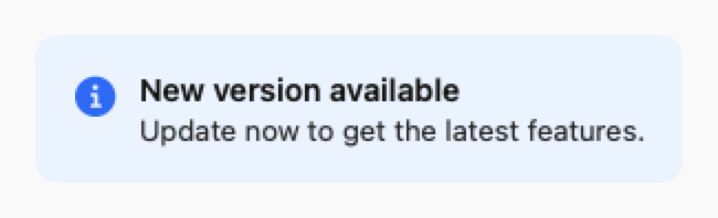
.info
Blue with info icon
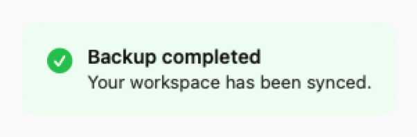
.success
Green with checkmark icon
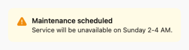
.warning
Yellow with warning icon
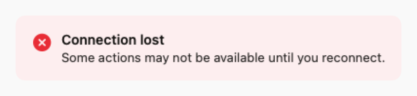
.error
Red with error icon
Props
| Prop | Type | Default | Description |
|---|---|---|---|
| style | DSNoticeBarStyle | .info | Style: .info, .success, .warning, or .error |
| icon | String? | nil | Optional SF Symbol (defaults to style icon) |
| titlereq | String | — | Notice title |
| message | String? | nil | Optional body text |
| linkText | String? | nil | Optional action link text |
| linkAction | (() -> Void)? | nil | Action for link tap |
| onDismiss | (() -> Void)? | nil | If set, shows close button |
Examples
Update notice
Announcement with action link.
swift
DSNoticeBar(
    style: .info,
    title: "New version available",
    message: "Update now to get the latest features.",
    linkText: "Update",
    linkAction: { updateApp() },
    onDismiss: { hideNotice() }
)
Warning banner
Warning notice without dismiss.
swift
DSNoticeBar(
    style: .warning,
    title: "Maintenance scheduled",
    message: "Service will be unavailable on Sunday 2-4 AM."
)
Usage Guidelines
- Use at top of screen or section for visibility
- Include dismiss button for non-critical notices
- Keep title short and message concise
- Use appropriate style for message severity