Feedback/DSTidbit
DSTidbit
feedbackInline callout card with icon, title, body text, optional button, and dismiss.
iOSmacOS
Purpose
Use for contextual tips, hints, or inline notifications within content. Less intrusive than modals.
Interactive Reference
Live showroom
Need the full visual surface?
Screenshots do not scale well across every component, state, and variant. For the real interactive reference, import the package and launch DSShowcaseRoot().
Best for exploring:
variants, states, categories, and real app examples in one place.
Variants
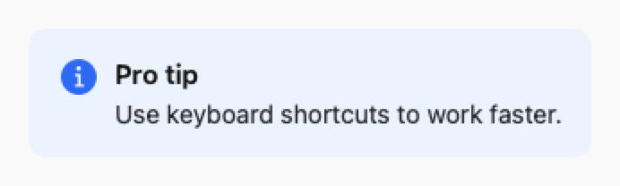
.info
Blue with info icon

.success
Green with checkmark icon
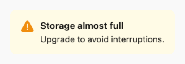
.warning
Yellow with warning icon
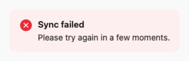
.error
Red with error icon
Props
| Prop | Type | Default | Description |
|---|---|---|---|
| title | String? | nil | Optional title |
| bodyreq | String | — | Main text content |
| style | DSTidbitStyle | .info | Style: .info, .success, .warning, or .error |
| buttonTitle | String? | nil | Optional button label |
| buttonAction | (() -> Void)? | nil | Optional button action |
| onDismiss | (() -> Void)? | nil | If set, shows close button |
| accessibilityLabel | String? | nil | Optional accessibility label |
Examples
Helpful tip
Inline tip with action button.
swift
DSTidbit(
    title: "Pro tip",
    body: "Use keyboard shortcuts to work faster.",
    style: .info,
    buttonTitle: "Learn more",
    buttonAction: { showShortcuts() },
    onDismiss: { dismissTip() }
)
Warning message
Warning without title or actions.
swift
DSTidbit(
    body: "Changes will be lost if you navigate away.",
    style: .warning
)
Usage Guidelines
- Use for contextual, non-blocking messages
- Place near related content for context
- Keep body text concise (1-2 sentences)
- Use dismiss button for optional tips, not critical warnings