DSToast
feedbackNon-intrusive notification that appears at the top of the screen. Available as both a standalone component and a .dsToast() view modifier.
Purpose
Confirm actions or alert the user without interrupting the flow. Auto-dismisses after a configurable duration.
Interactive Reference
Live showroom
Need the full visual surface?
Screenshots do not scale well across every component, state, and variant. For the real interactive reference, import the package and launch DSShowcaseRoot().
Best for exploring:
variants, states, categories, and real app examples in one place.
Variants
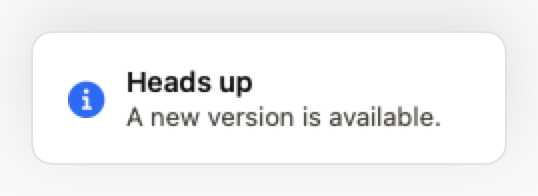
.info
Neutral information. Blue icon.
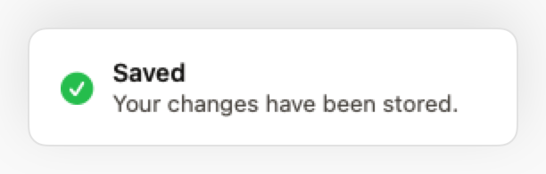
.success
Confirmation of a successful action. Green icon.
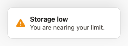
.warning
Alert requiring attention. Yellow icon.
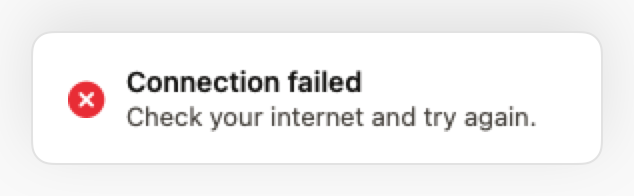
.error
Failure or critical error. Red icon.
States
Slide-down + fade-in entry animation.
Slide-up + fade-out exit animation.
Props
| Prop | Type | Default | Description |
|---|---|---|---|
| titlereq | String | — | Main text. |
| message | String? | nil | Optional secondary text. |
| style | DSToastStyle | .info | Visual and semantic style. |
| onDismiss | (() -> Void)? | nil | Callback when dismissed. |
Examples
Via modifier (recommended)
Shows a success toast after saving.
ContentView()
    .dsToast(
        isPresented: $showSavedToast,
        title: "Saved successfully",
        message: "Your changes have been stored.",
        style: .success,
        duration: 3.0
    )
Error toast
Shows an error after a network failure.
ContentView()
    .dsToast(
        isPresented: $showError,
        title: "Connection failed",
        message: "Check your internet and try again.",
        style: .error
    )
Composition: Form with feedback
Show toast after form submission.
VStack {
    Form {
        DSTextField(label: "Name", text: $name)
        DSTextField(label: "Email", text: $email)

        DSButton("Submit", variant: .primary) {
            submitForm()
            showSuccessToast = true
        }
    }
}
.dsToast(
    isPresented: $showSuccessToast,
    title: "Form submitted",
    message: "We'll get back to you soon!",
    style: .success
)
Usage Guidelines
- Prefer .dsToast() over the standalone DSToast component.
- Minimum duration of 3s for comfortable reading.
- Do not stack more than 1 toast at a time.
When to Use
✓ Use DSToast for:
- • Confirming successful actions (saved, deleted, sent)
- • Non-critical errors that don't block the flow
- • Quick informational messages
- • Background process completions
✗ Avoid using for:
- • Critical errors requiring user action (use DSAlert or DSModal)
- • Long messages that need more than 5 seconds to read (use DSAlert)
- • Persistent information (use DSNoticeBar)
- • Complex actions with multiple buttons (use DSModal)
Consider instead:
For inline alerts that stay visible until dismissed
For critical errors requiring user acknowledgment
For persistent banners at top of screen
For contextual hints near specific UI elements
Accessibility
VoiceOver
Announces title and message with style context (e.g., 'Success: Saved successfully')
Keyboard
- • Escape to dismiss (macOS)
- • Auto-dismisses after duration
Dynamic Type
✓ Supported
Contrast
WCAG AA compliant (icon and text 4.5:1)
Traits
.isAlertAnnounced immediately when shownNon-blocking