DSCard
data-displayContent container with 4 visual variants, large border radius, and interactive hover support. Generic over any View as content.
Purpose
Groups related content with clear visual hierarchy. The foundation for most grid and feed layouts.
Interactive Reference
Live showroom
Need the full visual surface?
Screenshots do not scale well across every component, state, and variant. For the real interactive reference, import the package and launch DSShowcaseRoot().
Best for exploring:
variants, states, categories, and real app examples in one place.
Variants
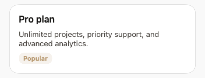
.elevated
Shadow and white/dark background. The default for most cases.
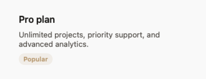
.outlined
Border only, no shadow. Good for contexts that are already elevated.
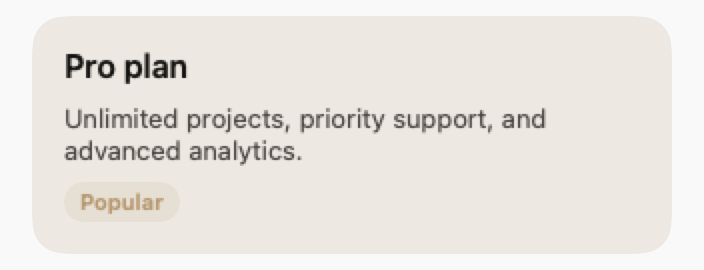
.filled
Lightly tinted background (secondaryMuted).
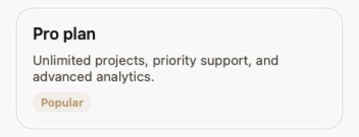
.ghost
No border and no shadow. Layout only.
States
Resting state.
When isInteractive: true, scales 1.01× with shadow md.
Props
| Prop | Type | Default | Description |
|---|---|---|---|
| variant | DSCardVariant | .elevated | Visual style. |
| padding | CGFloat | DSSpacing.md | Internal padding. |
| isInteractive | Bool | false | Enables hover effect. |
| action | (() -> Void)? | nil | Makes the card tappable. |
| contentreq | ViewBuilder | — | Internal content. |
Examples
Simple card
Static content in an elevated card.
DSCard {
    VStack(alignment: .leading, spacing: DSSpacing.sm) {
        Text("Title")
            .font(.system(size: 17, weight: .semibold))
        Text("Card description")
            .font(.system(size: 14))
            .foregroundStyle(DSColor.muted)
    }
}
Interactive card
Tappable card with hover effect.
DSCard(variant: .elevated, isInteractive: true, action: {
    navigate(to: .projectDetail)
}) {
    VStack(alignment: .leading, spacing: DSSpacing.sm) {
        HStack {
            Text(project.name)
                .font(.system(size: 16, weight: .semibold))
            Spacer()
            DSBadge(text: project.status, variant: .soft)
        }
        Text(project.description)
            .font(.system(size: 13))
            .foregroundStyle(DSColor.muted)
    }
}
Composition: Profile card
Card with avatar, text, and action button.
DSCard(variant: .outlined, padding: DSSpacing.lg) {
    HStack(spacing: DSSpacing.md) {
        DSAvatar(initials: user.initials, size: .lg)

        VStack(alignment: .leading, spacing: 4) {
            Text(user.name)
                .font(.system(size: 16, weight: .semibold))
            Text(user.role)
                .font(.system(size: 13))
                .foregroundStyle(DSColor.muted)
        }

        Spacer()

        DSButton("Follow", variant: .primary, size: .sm) {
            followUser()
        }
    }
}
Usage Guidelines
- Avoid nesting DSCards. Use variant: .ghost for the inner card.
- Interactive cards must always have an accessibilityLabel.
When to Use
✓ Use DSCard for:
- • Grouping related content in grids or feeds
- • Interactive list items that navigate to detail screens
- • Feature highlights or product cards
- • Dashboard widgets and metric displays
✗ Avoid using for:
- • Full-screen content (use DSContainer or plain VStack)
- • Single text labels (use DSBadge or DSTag)
- • List rows with standard iOS styling (use DSListRow)
Consider instead:
For full-width content sections without card styling
For iOS-style list items with disclosure indicators
For marketing feature highlights with icons
Accessibility
VoiceOver
Announces content and 'Card' trait. Interactive cards announce 'Button, Card'
Keyboard
- • Space or Return to activate (if interactive)
- • Tab to focus
Dynamic Type
✓ Supported
Contrast
WCAG AA compliant (border 3:1 minimum)
Traits
.isButton when action is setChildren content preserved