DSBadge
data-displayCompact label with 3 visual variants (filled, soft, outline), gradient support, and 3 size options.
Purpose
Status indicators, notification counts, and category labels with optional gradient styling.
Interactive Reference
Live showroom
Need the full visual surface?
Screenshots do not scale well across every component, state, and variant. For the real interactive reference, import the package and launch DSShowcaseRoot().
Best for exploring:
variants, states, categories, and real app examples in one place.
Variants
.filled
Solid background. High contrast.
.soft
Tinted background with matching text. Default.
.outline
Border only. Lightest visual weight.
Props
| Prop | Type | Default | Description |
|---|---|---|---|
| labelreq | String | — | Badge text. |
| variant | DSBadgeVariant | .soft | Visual style. |
| color | Color | DSColor.primary | Semantic colour (used if gradient is nil). |
| gradient | LinearGradient? | nil | Optional gradient (overrides color for filled variant). |
| icon | String? | nil | Optional leading SF Symbol. |
| size | DSBadgeSize | .md | Badge size: .sm, .md, or .lg. |
Examples
Status badges
Order statuses in a list.
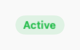
DSBadge("Active", color: DSColor.success)
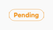
DSBadge("Pending", color: DSColor.warning)
DSBadge("Cancelled", variant: .outline, color: DSColor.error)Notification count
Badge with count on navigation item.
HStack {
    Image(systemName: "bell")
    DSBadge("3", variant: .filled, color: DSColor.error, size: .sm)
}
Category badges with gradients
Use DSColor.Category for themed badges.
HStack {
    DSBadge("Chest", category: .category1, icon: "figure.arms.open")
    DSBadge("Back", category: .category2, icon: "figure.walk")
    DSBadge("Legs", category: .category3, icon: "figure.run")
}
Different sizes
Small, medium, and large badges.
VStack(alignment: .leading, spacing: 8) {
    DSBadge("Small", size: .sm)
    DSBadge("Medium", size: .md)
    DSBadge("Large", size: .lg, icon: "star.fill")
}
Composition: Card with badges
Product card with multiple status badges.
DSCard {
VStack(alignment: .leading, spacing: DSSpacing.sm) {
HStack {
Text(product.name)
.font(.system(size: 16, weight: .semibold))
Spacer()
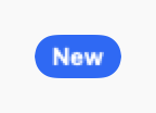
DSBadge("New", variant: .filled, color: DSColor.info)
}
HStack {
DSBadge("In Stock", icon: "checkmark", color: DSColor.success)
DSBadge("Sale", color: DSColor.accent)
}
}
}When to Use
✓ Use DSBadge for:
- • Status indicators (Active, Pending, Completed)
- • Notification counts on icons or tabs
- • Category labels that are read-only
- • Version tags or feature flags
✗ Avoid using for:
- • Interactive filters (use DSChip instead)
- • Removable tags (use DSTag with onRemove)
- • Large text labels (use Text with background)
- • Status with icons and longer text (use DSStatusLabel)
Consider instead:
For interactive, selectable filters
For removable category tags
For status with icon and more context
Accessibility
VoiceOver
Announces label and color context (e.g., 'Active, Badge, Success')
Keyboard
- • Not interactive - no keyboard controls
Dynamic Type
✓ Supported
Contrast
WCAG AA compliant for all variants
Traits
.isStaticTextColor conveyed via label when needed