DSStatusLabel
data-displayStatus label with icon indicating success, warning, error, info, or neutral state.
Purpose
Use to display status information with appropriate color and icon. Provides instant visual feedback.
Interactive Reference
Live showroom
Need the full visual surface?
Screenshots do not scale well across every component, state, and variant. For the real interactive reference, import the package and launch DSShowcaseRoot().
Best for exploring:
variants, states, categories, and real app examples in one place.
Variants
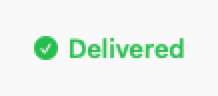
.success
Green with checkmark icon
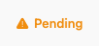
.warning
Yellow with warning icon
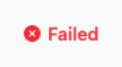
.error
Red with error icon

.info
Blue with info icon

.neutral
Gray with circle icon
Props
| Prop | Type | Default | Description |
|---|---|---|---|
| textreq | String | — | Status text |
| stylereq | DSStatusStyle | — | Status style: .success, .warning, .error, .info, .neutral |
| showIcon | Bool | true | Show status icon |
Examples
Order status
Show order status with appropriate style.
switch order.status {
case .delivered:
    DSStatusLabel(text: "Delivered", style: .success)
case .pending:
    DSStatusLabel(text: "Pending", style: .warning)
case .cancelled:
    DSStatusLabel(text: "Cancelled", style: .error)
}
System health
Display system or service status.
HStack(spacing: DSSpacing.sm) {
    Text("API Status:")
        .font(.system(size: 14))
    DSStatusLabel(text: "Operational", style: .success)
}
Composition: List with status
List items with status indicators.
ForEach(tasks) { task in
    DSCard {
        HStack {
            VStack(alignment: .leading, spacing: 4) {
                Text(task.title)
                    .font(.system(size: 16, weight: .semibold))
                Text(task.description)
                    .font(.system(size: 13))
                    .foregroundStyle(DSColor.muted)
            }
            Spacer()
            DSStatusLabel(
                text: task.status.displayName,
                style: task.status.style
            )
        }
    }
}
Usage Guidelines
- Use semantic colors that match the status meaning
- Keep text short and clear (1-2 words)
- Icons provide quick visual scanning
When to Use
✓ Use DSStatusLabel for:
- • Status indicators with semantic meaning (success, warning, error)
- • System health or service status displays
- • Order, task, or process status in lists
- • Real-time status updates with icons
✗ Avoid using for:
- • Non-status labels (use DSBadge)
- • Interactive filters (use DSChip)
- • Simple text without semantic meaning (use Text)
- • Count indicators (use DSBadge)
Consider instead:
For non-status labels without semantic icons
For interactive, selectable filters
For full-width status banners
Accessibility
VoiceOver
Announces '[text], Status, [style]' (e.g., 'Delivered, Status, Success')
Keyboard
- • Not interactive - display only
Dynamic Type
✓ Supported
Contrast
WCAG AA compliant (icon and text 4.5:1)
Traits
.isStaticTextIcon meaning conveyed via style nameColor not sole indicator